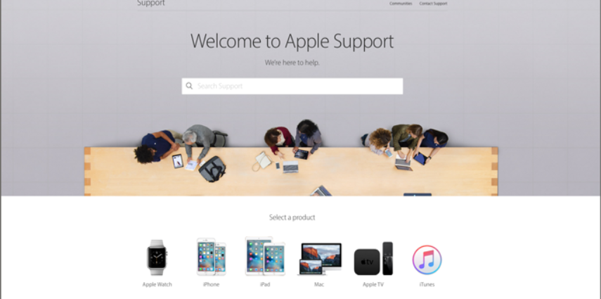
Apple announced the redesign of their support area on their website and it is typical Apple design. Clean, easy and very attractive web layout prevails. You still have the ability to check their database, and Apple Communities, and get a phone call or Genius Bar appointment scheduled. You can check your warranty status with a new, improved link to sign in so you don’t need to look up your serial number. This was something that really bugged me in the past. The link to sign in to your support site was so hard to find, I had to save a bookmark to get back there. As most of you know, this Apple fangirl has a lot of Apple products to manage. 🙂
The design is still minimalist, but with many features and information typical to the way Apple operates. They try to anticipate what you might need before you know you need it. If you poke around, you will find lots of useful information displayed in an attractive, responsive layout that makes you want to redesign your own website. Take some time to look around on just one of your products and you will be enticed to check out more information.
I can sum up Apple’s upgrade to their support site, by saying that it is elegant, user-friendly, and inspirational. Check it out yourself and let me know what you think.


Used this and got great response!